Dev & Code
Free
v1.0
Automotive Hero , Clip-Path Buttons, Liquid Glass Card & Brand Red Accents
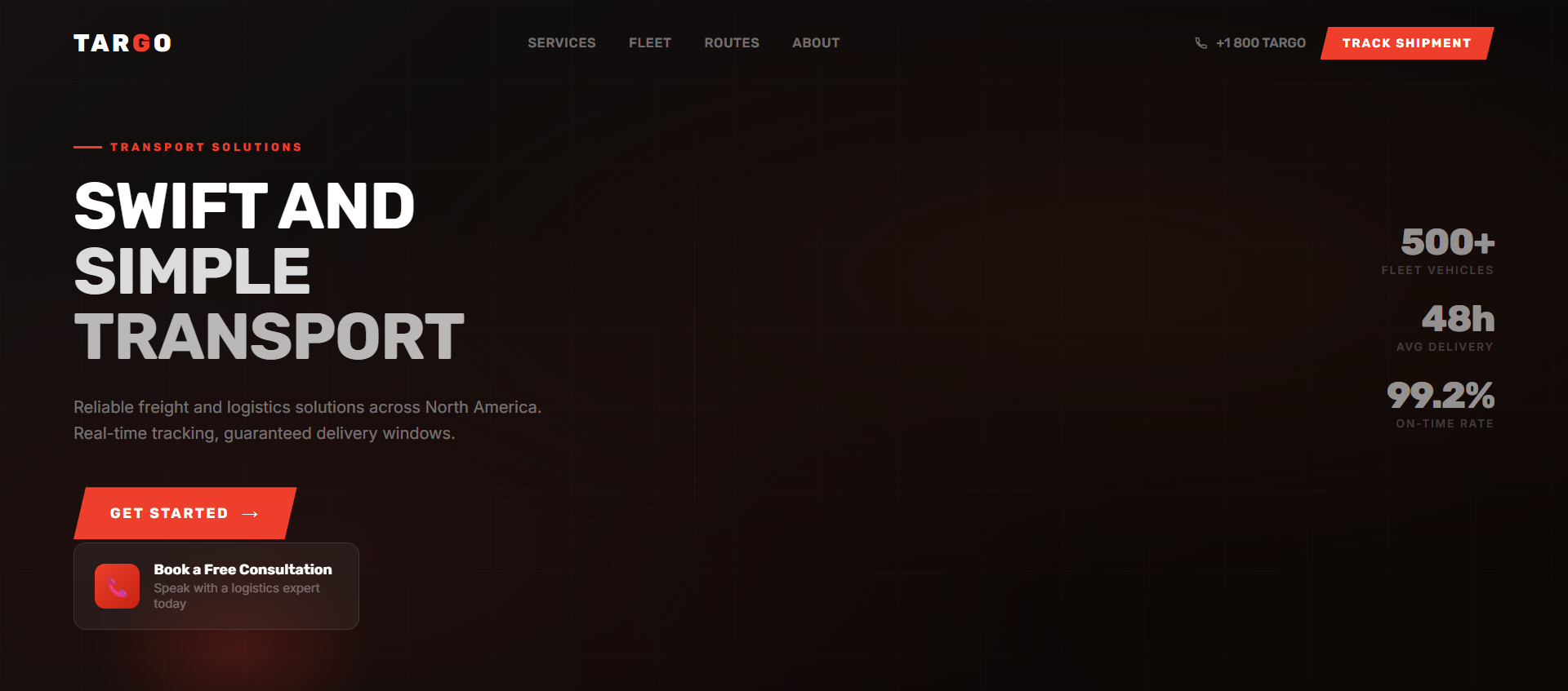
Dark logistics hero with video background, custom clip-path geometric buttons, advanced liquid glass consultation card, and left-aligned top-positioned headline. Rubik Bold.
automotive
hero
claude
lovable
cursor
react
tailwind
glassmorphism
clip-path
video-background
dark-theme
When to use
Use for logistics companies, automotive brands, transport services, or any industrial/physical business that wants a modern dark web presence.
Recommended LLMs
Claude Sonnet
GPT-4o
Plugins / Skills
Artifacts (Claude)
When to use
The signature feature here is the clip-path button — a custom geometric shape with diagonal cuts on the top-right and bottom-left corners. It's a design language borrowed from automotive/military/industrial branding. The liquid glass card at the bottom-left anchors the layout as a conversion element.
What you'll need to customise
- Video URL — swap the CloudFront MP4
- Brand color —
#EE3F2C(brand red) — used on nav CTA, "Get Started" button, and accents - Headline — "Swift and Simple Transport" — keep Rubik Bold uppercase style
- Liquid glass card — "Book a Free Consultation" with phone number or CTA
Tips for best results
- The clip-path shape:
clip-path: polygon(12px 0%, 100% 0%, calc(100% - 12px) 100%, 0% 100%)creates the diagonal top-right/bottom-left cut - The liquid glass card needs all four layers:
backdrop-filter,border border-white/12, diagonal shine gradient, and inner box-shadow - Content is left-aligned and top-positioned — use
justify-start+pt-32, notitems-center - Rubik Bold uppercase at
64pxdesktop /42pxmobile — letter-spacing-4%
Expected output
React component with:
- Standard transparent navbar (white logo + clipped-corner red nav CTA)
- Full-screen video background (100% opacity)
- Left-aligned upper-third headline + "Get Started" clipped red button
- Bottom-left liquid glass consultation card with phone icon
- Responsive layout
The Prompt
Copy it, paste it, use it.
Design and build a dark-themed hero section for a logistics brand. React + Tailwind CSS.

### Tech Stack
- React + TypeScript
- Tailwind CSS
- lucide-react
- Google Fonts: "Rubik" (Bold)

### Brand Colors
- Black: `#000000`
- Brand Red: `#EE3F2C`
- White: `#FFFFFF`

### Background Video
- URL: `https://d8j0ntlcm91z4.cloudfront.net/user_38xzZboKViGWJOttwIXH07lWA1P/hf_20260227_042027_c4b2f2ea-1c7c-4d6e-9e3d-81a78063703f.mp4`
- `absolute inset-0 w-full h-full object-cover`
- `autoPlay loop muted playsInline`
- 100% opacity — no dark overlay

### Clip-Path Button Mixin
All primary buttons use this shape (diagonal cuts top-right and bottom-left):
```css
clip-path: polygon(12px 0%, 100% 0%, calc(100% - 12px) 100%, 0% 100%);
```
Apply via Tailwind arbitrary value: `[clip-path:polygon(12px_0%,100%_0%,calc(100%-12px)_100%,0%_100%)]`

### Navbar
- Transparent, `flex items-center justify-between px-[64px] md:px-[120px] py-6 relative z-20`
- Left: White SVG logo ("targo" wordmark — use placeholder white text)
- Center (desktop): "Home", "About", "Contact Us" — white Rubik Medium
- Right: "Contact Us" button — `bg-[#EE3F2C] text-white px-5 py-2 Rubik Medium text-sm` with clip-path applied

### Hero Content
- Left-aligned, upper-third positioning: `absolute top-[25%] left-[64px] md:left-[120px] z-10`
- NOT centered

**Headline:**
- "Swift and Simple Transport"
- Rubik Bold, Uppercase, White
- `text-[42px] md:text-[64px] leading-[1.1] tracking-[-0.04em]`

**"Get Started" Button:**
- `bg-[#EE3F2C] text-white` + clip-path
- `px-8 py-4 Rubik Bold text-base uppercase mt-6`
- `hover:brightness-110 transition-all`

### Liquid Glass Consultation Card (bottom-left)
- Position: `absolute bottom-8 left-[64px] md:left-[120px] z-20`
- Size: approximately `320px × 120px`
- Styling (all four layers required):
  1. `backdrop-filter: blur(40px) saturate(180%)`
  2. `border: 1px solid rgba(255,255,255,0.12)`
  3. Diagonal shine: `background: linear-gradient(135deg, rgba(255,255,255,0.08) 0%, rgba(255,255,255,0) 60%)`
  4. Inner shadow: `box-shadow: inset 0 1px 1px rgba(255,255,255,0.15), 0 8px 32px rgba(0,0,0,0.3)`
  5. `border-radius: 12px`
- Content: `flex items-center gap-4 p-5`
  - Phone icon (lucide-react, white, 20×20) in a small red circle `bg-[#EE3F2C] rounded-full w-10 h-10`
  - Text column: "Book a Free Consultation" (white, Rubik Medium 14px) + "+44 000 000 0000" (white/70, 12px)
- CTA: "Book a Call" button — white bg, black text, clip-path applied, `text-xs px-4 py-2`

### Responsive
- Headline: `text-[42px]` mobile / `text-[64px]` desktop
- Padding: `px-8` mobile / `px-[120px]` desktop
- Content position adjusts for mobile: switch from `absolute` to normal flow below navbar